
UI Icons and Illustrated Icons
There are two main icon set you should know all about. The first is UI icons, and the second is Illustrated icons.
UI Icons
A UI (User Interface) icon is a graphical representation or symbol used in a user interface to convey a specific action, function, or idea. Icons are designed to be visually intuitive, providing users with a quick and easily recognizable way to interact with a software application, website, or digital device. These icons are typically small, simple, and visually distinct to ensure clarity and ease of understanding.
UI icons play a crucial role in enhancing user experience by serving as visual cues that help users navigate and interact with the interface more efficiently. Common examples of UI icons include symbols for actions like saving, deleting, printing, or undoing, as well as representations of objects such as folders, documents, and settings.
Icon design follows principles of simplicity and universality, aiming to be easily understood across diverse user demographics and cultural backgrounds. Icons may be monochromatic or use a limited color palette, and they often adhere to a consistent visual style within a particular interface or design system.
In modern UI/UX design, icons are essential components that contribute to the overall aesthetics and functionality of an interface, aiding users in quickly interpreting and interacting with different elements and features.
Here are some key aspects of icon grid design:
- Consistency: Icon grids enforce consistency by ensuring that all icons share similar dimensions, spacing, and alignment. This consistency contributes to a cohesive visual identity and improves the overall user experience.
- Alignment: Icons are placed on the grid in a way that aligns them both horizontally and vertically. This alignment aids in creating a neat and orderly appearance, reducing visual clutter and making it easier for users to focus on the content.
- Spacing: The grid provides consistent spacing between icons, preventing overcrowding and improving readability. Adequate spacing is crucial for preventing visual fatigue and enhancing the overall aesthetics of the interface.
- Hierarchy: Icon grids can be used to establish a hierarchy among different types of icons. For example, more frequently used or primary actions may be placed in a prominent position within the grid, while secondary or less frequently used actions may be positioned elsewhere.
- Responsive Design: Icon grids are adaptable to different screen sizes and resolutions, ensuring that the layout remains visually appealing and functional across various devices. This is particularly important in the context of responsive web design and mobile applications.
- Design Systems: Icon grids often play a role in design systems, where a set of rules and guidelines govern the consistent use of icons and other design elements. This helps maintain a unified visual language throughout an application or website.
- Scalability: Icons designed on a grid are typically scalable, meaning they can be resized without losing their visual integrity. This scalability is essential for maintaining clarity and legibility across different screen sizes and resolutions.
In summary, an icon grid design is a strategic approach to organizing and presenting icons in a visually consistent and user-friendly manner, contributing to a more intuitive and aesthetically pleasing user interface.
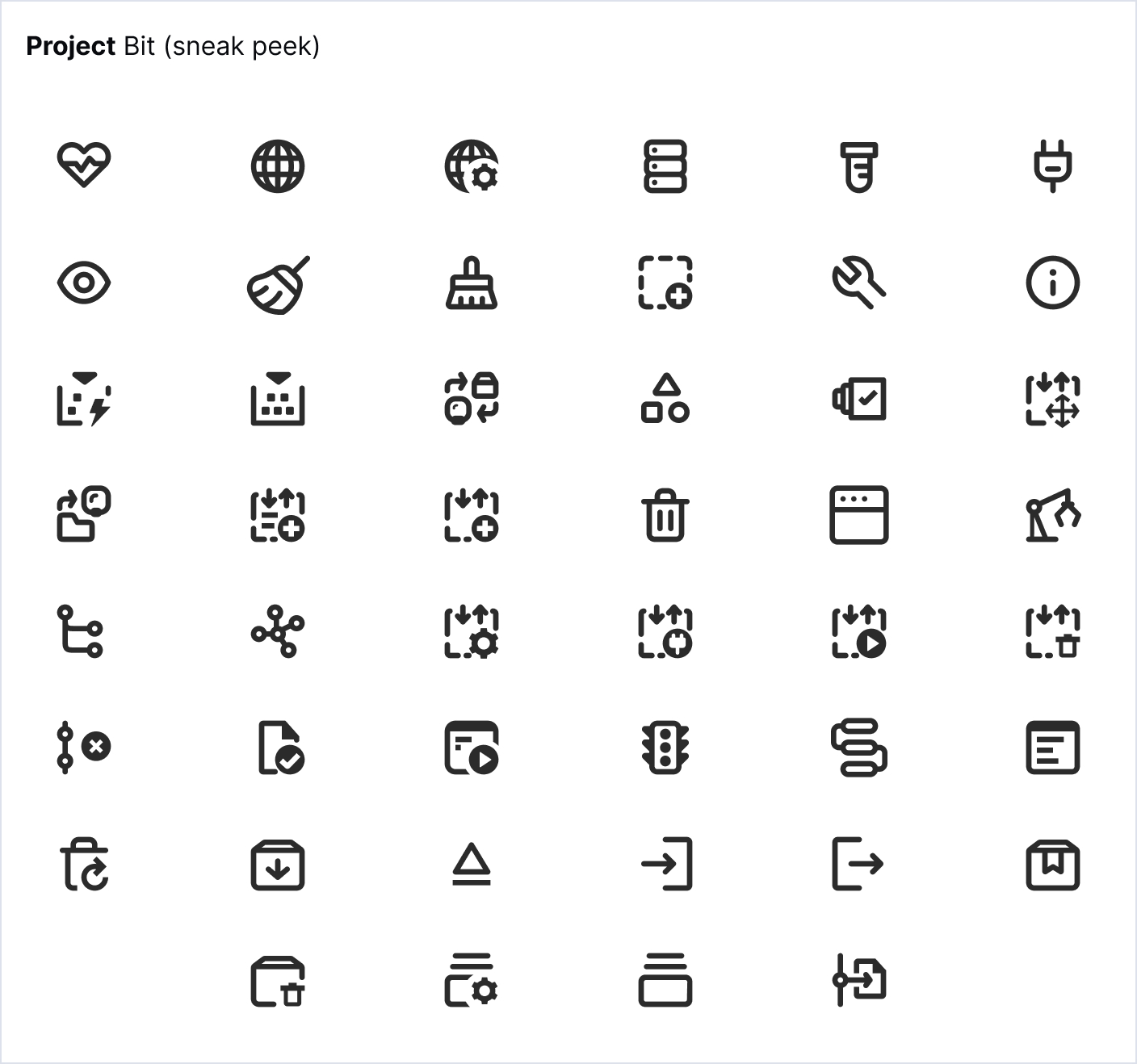
Examples of UI icons