
UI Icons and Illustrated Icons
Icons play a critical role in modern design, acting as visual shortcuts that enhance usability and enrich user experiences. When discussing icons, it’s essential to distinguish between two main types: UI icons and illustrated icons.
UI Icons
UI (User Interface) icons are small graphical symbols designed to represent actions, objects, or functions within an interface. Their primary purpose is to be instantly recognizable, helping users navigate and interact with software, websites, or devices efficiently.
Key Characteristics of UI Icons:
- Simplicity: Designed to be straightforward and universally understood, avoiding unnecessary complexity.
- Consistency: They adhere to a consistent style and grid system to create a unified visual language.
- Functionality: UI icons focus on conveying meaning, such as actions like saving, editing, or deleting, and objects like settings or documents.
Why Are UI Icons Important? UI icons significantly improve usability by acting as intuitive visual cues. They reduce cognitive load, enhance navigation, and provide a polished look to digital interfaces. Whether it’s a trash bin icon for deletion or a magnifying glass for search, these symbols streamline user interactions.
Design Principles for UI Icons
- Icon Grid Design:
- Grids ensure uniformity by aligning icons horizontally and vertically.
- Consistent dimensions and spacing improve clarity and maintain visual order.
- Scalability:
- Icons should remain sharp and legible across various screen sizes and resolutions.
- Responsive Design:
- UI icons should adapt seamlessly to different devices, ensuring usability on both desktop and mobile platforms.
- Hierarchy:
- Place frequently used icons in prominent positions to guide user attention effectively.
Illustrated Icons
Illustrated icons are more detailed and creative compared to their UI counterparts. Often used for storytelling or to add personality to a brand, these icons go beyond functionality to evoke emotion or provide a visual narrative.
Key Characteristics of Illustrated Icons:
- Detail: They include intricate designs, colors, and sometimes even shadows or gradients.
- Expressiveness: Illustrated icons are crafted to convey tone or mood, such as friendliness or sophistication.
- Use Cases: These icons are commonly found in onboarding flows, marketing visuals, or custom illustrations on websites.
While UI icons focus on functionality and simplicity, illustrated icons add flair and enhance the aesthetic appeal, making them ideal for branding or storytelling purposes.
Conclusion
Icons, whether functional UI elements or artistic illustrations, are essential tools in any designer’s toolkit. By understanding their unique purposes and design principles, you can create intuitive, visually appealing interfaces that resonate with your audience.
Here are some key aspects of icon grid design:
- Consistency: Icon grids enforce consistency by ensuring that all icons share similar dimensions, spacing, and alignment. This consistency contributes to a cohesive visual identity and improves the overall user experience.
- Alignment: Icons are placed on the grid in a way that aligns them both horizontally and vertically. This alignment aids in creating a neat and orderly appearance, reducing visual clutter and making it easier for users to focus on the content.
- Spacing: The grid provides consistent spacing between icons, preventing overcrowding and improving readability. Adequate spacing is crucial for preventing visual fatigue and enhancing the overall aesthetics of the interface.
- Hierarchy: Icon grids can be used to establish a hierarchy among different types of icons. For example, more frequently used or primary actions may be placed in a prominent position within the grid, while secondary or less frequently used actions may be positioned elsewhere.
- Responsive Design: Icon grids are adaptable to different screen sizes and resolutions, ensuring that the layout remains visually appealing and functional across various devices. This is particularly important in the context of responsive web design and mobile applications.
- Design Systems: Icon grids often play a role in design systems, where a set of rules and guidelines govern the consistent use of icons and other design elements. This helps maintain a unified visual language throughout an application or website.
- Scalability: Icons designed on a grid are typically scalable, meaning they can be resized without losing their visual integrity. This scalability is essential for maintaining clarity and legibility across different screen sizes and resolutions.
In summary, an icon grid design is a strategic approach to organizing and presenting icons in a visually consistent and user-friendly manner, contributing to a more intuitive and aesthetically pleasing user interface.
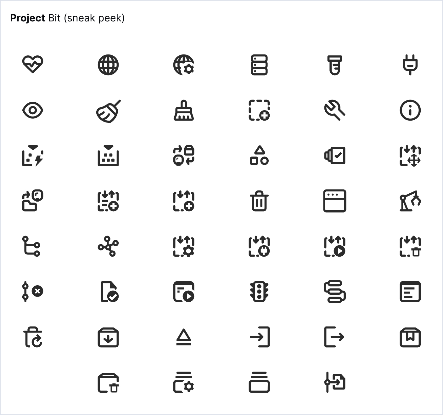
Examples of UI icons